|
By: Paul S Cilwa |
Posted: 11/6/2025 |
|
Page Views: 166 |
| Hashtags: #Maps #Geolocation #MercatorProjection #GPS |
| How our continuing refinements to the act of mapping are necessary to our survival as a species. |
| Estimated reading time: 12 minute(s) (2711 words) |
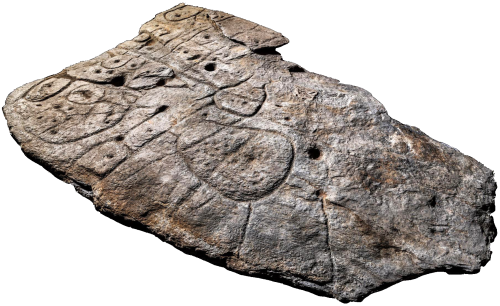
One candidate for the earliest territorial map is the
Saint-Bélec slab
from France, dated between 1900?1640 BCE. It's a carved stone whose etched
lines match the wanderings of the River Odet valley. Archaeologists compared
the engravings with local topography and concluded it was a three‑dimensional
representation of land boundaries—likely more political than navigational,
showing the domain of a Bronze Age ruler.
A few centuries later, the Babylonians produced the famous
Imago Mundi
(c. 6th century BCE), a clay tablet now in the British Museum (give it back, guys!).
It places Babylon at the center, encircled by a bitter river
(the ocean), with triangular
regions radiating outward. Scholars know it's a map because the accompanying
cuneiform text describes distances and mythic lands beyond the known world.
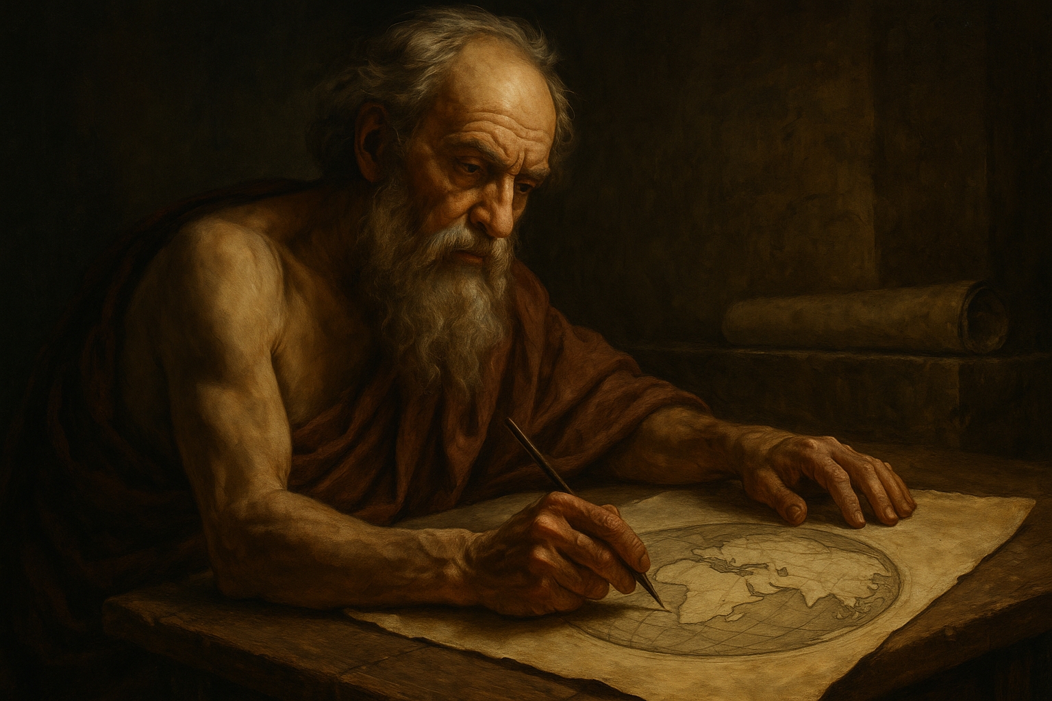
By the 6th century BCE, the Greek philosopher Anaximander sketched what's
often called the first world map.
Though the original is lost,
later writers describe it as a circular map with land surrounded by water,
Greece at the center, and Asia and Europe stretching outward. We know of it
through references in Herodotus and other classical texts, which preserve the
idea even if the parchment itself has vanished.
"The map is not the territory" is an old phrase that highlights the fact
that a map represents a geographic reality, but is not, itself, one.
Outside of Europe, it might seem as if peoples managed to make their maps out of the
actual environment. But memory of a route is not the route, even if the memory
is triggered by natural phenomenon such as a mountain or a peculiar-shaped rock or
even an ocean current. So various cultures, needing as we all do to navigate,
found ways to map their surroundings that used our skill at observing and
interpreting patterns to find their way, often over thousands of miles.
These traditions demonstrate that mapping is not just about drawing lines on
paper—it's about encoding spatial knowledge in culture, memory, and environment.
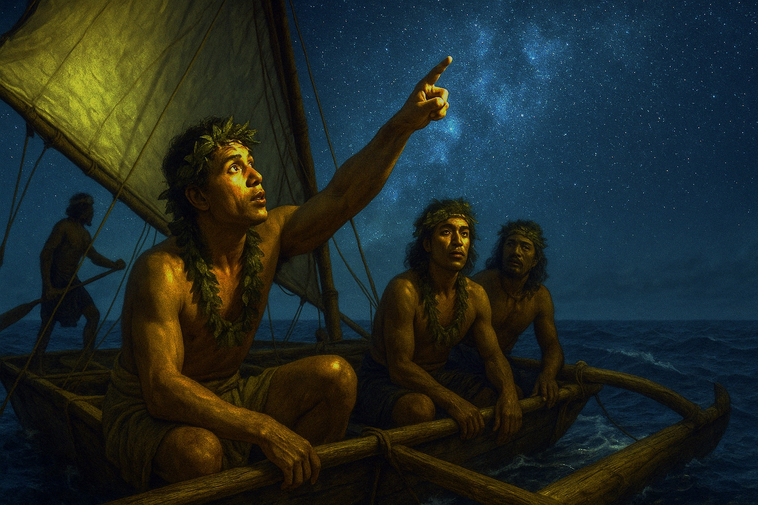
Polynesian navigators crossed open ocean using wayfinding
techniques that blended astronomy, oceanography, and memory. They memorized
the rising and setting points of stars, read the swells of the sea, and watched
for cloud formations that revealed islands below. Frigatebirds
and terns also served as living signposts, their flight patterns hinting at nearby land.
These methods were passed down orally through generations of master navigators,
and modern oceanographers have confirmed their astonishing accuracy.
Aboriginal Australians developed songlines, oral maps encoded in story and ceremony.
Each verse of a song described a landmark—a hill, a waterhole, a rock
formation—and by singing the sequence, travelers could cross vast distances
with precision. Songlines weren't just personal guides; they stretched across the
continent, linking communities and trade routes. Different groups might sing the
same path in different languages, but the geography remained consistent, preserving
both cultural identity and practical navigation.
In the Arctic, Inuit navigators relied on snowdrift patterns, ice formations, and
subtle landmarks invisible to outsiders. Wind-carved ridges in the snow, called
sastrugi, pointed in consistent directions, serving as natural compasses. Combined
with an intimate knowledge of seasonal light and sky, these techniques allowed
Inuit travelers to move confidently across landscapes that to others seemed featureless.
Their methods highlight how navigation can be rooted in sensory detail and environmental
familiarity rather than abstract grids.
Asian mapping traditions reveal how cartography (the fancy word for mapping)
was as much about culture and cosmology as geography. China, Korea, Japan,
and the Islamic world each developed distinctive ways of representing space,
usually placing their own lands at the center.
In China, maps were produced on silk as early as the Han dynasty (2nd century BCE).
These maps combined practical detail—rivers, roads, administrative
boundaries—with cosmological ideas. China was depicted as the
Middle Kingdom,
literally at the center of the world. Later dynasties
refined these traditions, producing large wall maps that blended artistry
with bureaucratic utility. Scholars know these maps from surviving silk
fragments and textual descriptions, which emphasize their dual role as both
administrative tools and cultural statements.
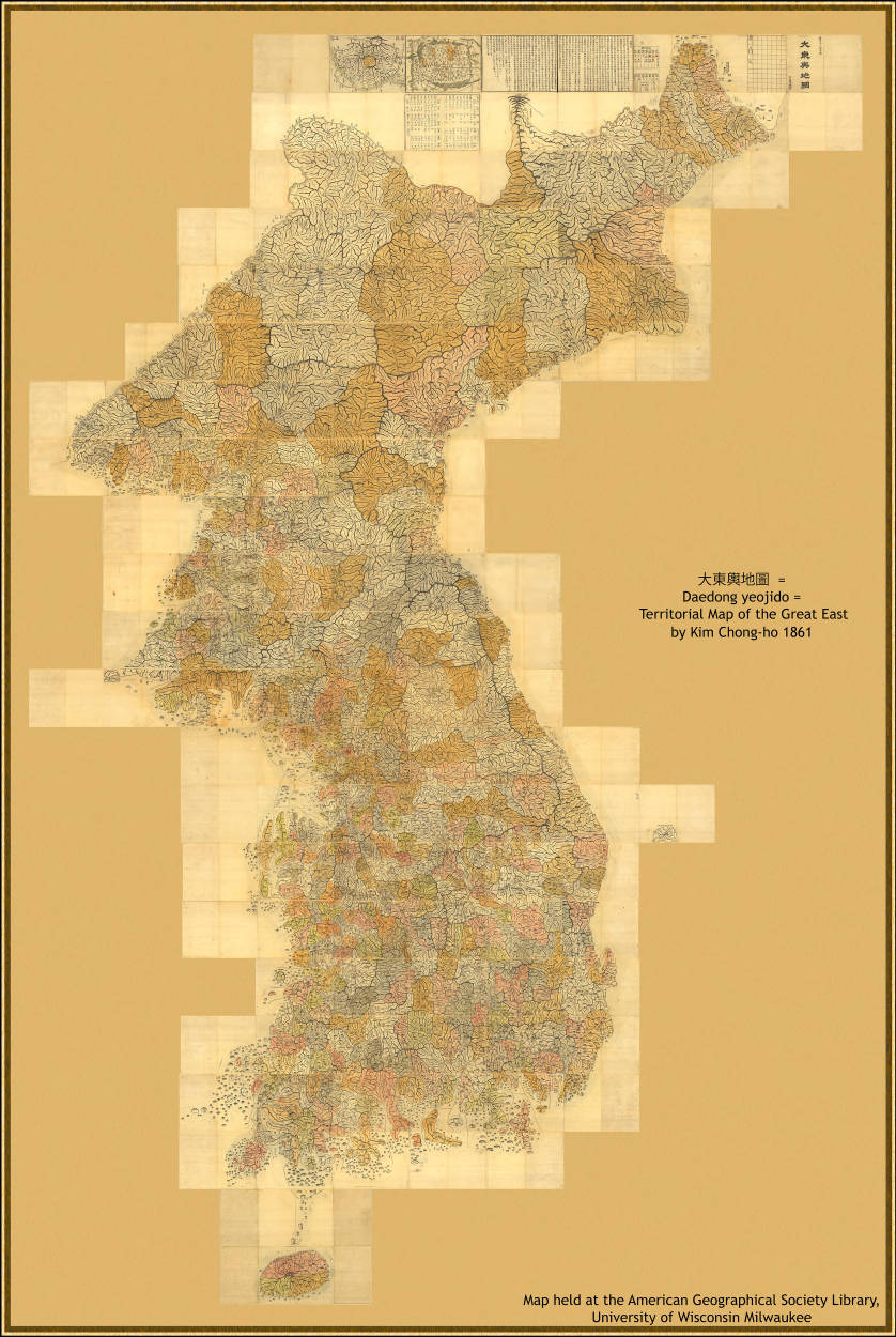
In Korea, cartography flourished during the Joseon dynasty (1392?1897). Korean
maps often emphasized mountains and rivers, echoing literary descriptions of the
land. Some were influenced by Chinese Buddhist pilgrimage maps, which placed
sacred sites in a cultural rather than geographic framework. Others, like
the massive Daedong Yeojido
(1861), were practical atlases used for
governance. These maps reveal how Korea balanced indigenous traditions with
imported Chinese and later European methods.
In Japan, maps from the Edo and Meiji periods often placed Japan at the center,
inflating its size relative to other regions. Some were highly stylized, more
like paintings than scientific charts, while others incorporated Western techniques
as Japan opened to trade in the 19th century. These maps show a tension between
cultural pride and global awareness. Meanwhile, in the Islamic world, al‑Idrisi's
famous Book of Roger
(1154) created a world map oriented with south at
the top, blending Greek geometry with merchant accounts. His work influenced
both Asian and European traditions, underscoring the interconnectedness of
cartographic knowledge.
Together, these traditions demonstrate that maps were not neutral diagrams but
cultural artifacts, shaped by religion, politics, and identity. They prepared
the ground for the Age of Discovery, when European navigators began flattening
the globe into charts for trade and conquest.
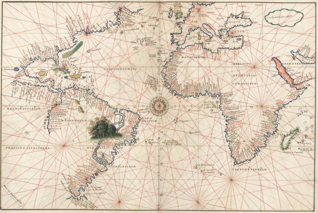
By the late 15th century, European sailors were pushing into oceans that no chart
had ever described. They relied on
Portolan charts,
first developed in the Mediterranean, which showed coastlines with
remarkable accuracy and were crisscrossed by rhumb lines—straight
paths radiating from compass roses. These charts were practical guides for
moving between ports, but they left the interiors blank, reflecting a world
where the sea was a vast and pretty scary unknown.
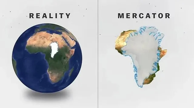
The need for long‑distance navigation led to innovations such as the Mercator projection,
introduced in 1569 by Gerardus Mercator and still in use today. Unlike earlier maps,
Mercator's flattened the globe in a way that allowed sailors to plot straight‑line
courses across oceans. It distorted landmasses—Greenland famously looms
enormous—but it gave navigators a reliable geometry for charting voyages.
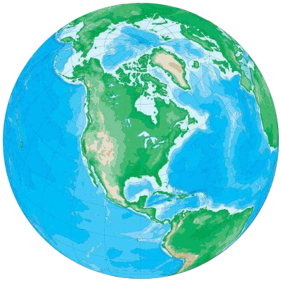 An actual Globe (map) of Earth
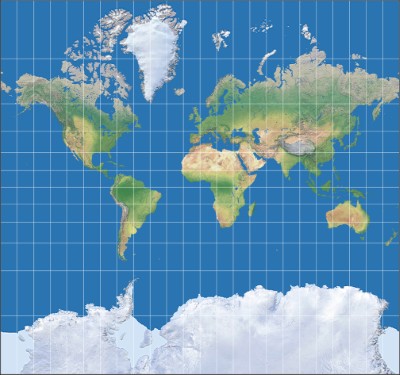 The stretched-out Mercator projection is better for navigation,
but exaggerates land masses near higher latitudes
The stretched-out Mercator projection is better for navigation,
but exaggerates land masses near higher latitudes
Cartographers of the era were not just technicians; they were storytellers.
Maps often included sea monsters, mythic islands, and elaborate coats of arms,
blending fact with imagination. Abraham Ortelius's Theatrum Orbis Terrarum (1570)
was the first modern atlas, gathering these charts into a single book that circulated
across Europe. Such works turned maps into instruments of empire: they guided
fleets, justified claims to distant lands, and reshaped how Europeans conceived the world.
By the 20th century, maps had become standardized tools: printed atlases,
fold-out road guides, and wall charts filled classrooms and automobiles alike.
They were authoritative, but static. If you wanted to know how long it would
take to drive from Phoenix to Flagstaff, you had to measure the distance with
a ruler, estimate your speed, and hope the road wasn't closed. The map showed
you where things were, but not how to move through them.
That changed with the rise of digital mapping, which began not with satellites but with
scanners. Early GIS (Geographic Information System) didn't know
geography—they
simply digitized paper maps, tracing lines and labeling features. Their maps were still pictures,
but now they lived inside a computer, ready to be queried.
What made this leap possible was the ability to represent geography as data.
Every location became a pair of numbers—latitude and longitude—stored
in a database. Roads became lines connecting those points. Calculating a route
wasn't just drawing a line; it was solving a puzzle. The computer had to figure
out which roads connected to which other roads; how fast you could travel,
and which path was shortest. It was the beginning of a new kind of map: one
that didn't just show the world, but helped you move through it.
Cartography once meant drawing coastlines and borders, but today's maps do far
more than trace geography! They coordinate layers of information that range
from weather, air quality, to the latest school shooting. A modern map is
less a picture than a living database, constantly
updated and cross‑referenced, able to show not just where things are but how
they interact in real time. That's why the old word mapping
feels too
limiting: the broader term Geographic Information System (GIS) captures the
reality that these tools are not static diagrams but dynamic engines,
integrating countless streams of data into a single, navigable view of
the world.
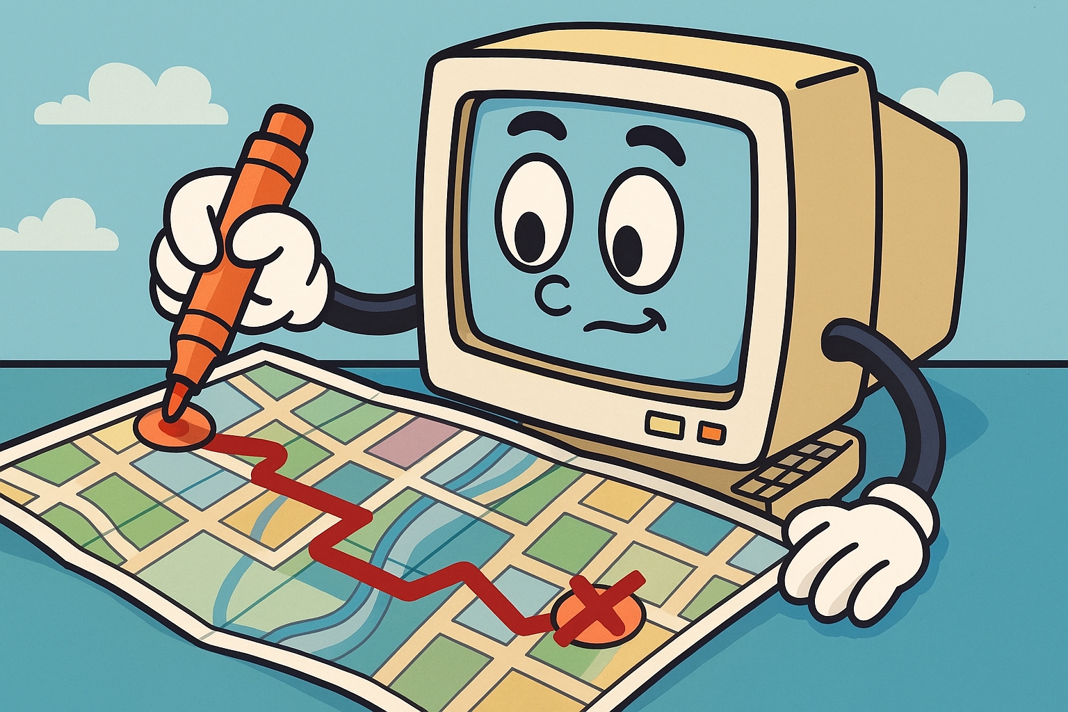
When you ask your phone or car for directions, it doesn't just draw a
line—it solves a puzzle. The streets are like a giant spiderweb,
with intersections as knots and roads as threads. The computer starts
at your current (or requested starting) location and explores outward,
looking for the shortest path to your destination. It's not guessing;
it's testing every option, like a traveler who checks every fork
in the road before choosing the best one.
Now, if that seems incredibly unwieldy to you—every possible
combination of roads??? But that's only because it would take years
to do all that math. But even a small computer like the one in your smartphone
"thinks" about five million times faster than you do. Of course, that's
like comparing a horse to a jet engine—one runs on oats, the other
on kerosene—but it makes the point. The map in your pocket isn't
just quicker; it's operating on a scale our brains can't touch.
Plus, there are mathematical shortcuts that can speed the calculations even more.
One of the classic methods is called Dijkstra's algorithm, which works like
a cautious explorer. It starts at Point A and moves outward step by step,
always choosing the shortest next move. It doesn't rush—it checks every
possibility until it finds the best route. Then there's another trick called
A* (pronounced A star
),
which adds a dash of intuition. It still checks paths, but it also guesses
which direction looks most promising, like someone saying,
That road feels faster—let's try it.
These algorithms don't care about scenery or landmarks—they care about
connections and cost. A highway might be faster than a side street, so the
computer gives it a lower cost.
If there's traffic, the cost goes up.
If a road is closed, it's removed from the web. The result is a route that
balances speed, distance, and real‑time conditions. It's not magic—it's
just math dressed up as common sense.
Now, how does your Internet map "know" if traffic lies ahead? Modern traffic
maps are updated in real time by the very cars driving on the roads!
When you use a navigation app, your phone's GPS (more on that in a moment!)
quietly reports your location
and speed back to the system. If hundreds of cars on a highway are suddenly
moving at 10 miles per hour, the app recognizes a slowdown and marks that
stretch in red. The more drivers using the app, the more accurate the picture
becomes. This floating car data
is anonymous and aggregated, so no
one sees individual trips, but together it creates a live pulse of the road
network. Combined with user‑reported incidents (like accidents or closures)
and city sensor feeds, the app can reroute drivers in real time—turning
every car into both a traveler and a tiny traffic reporter.
But input doesn't stop there, because you, yourself, are a willing participant.
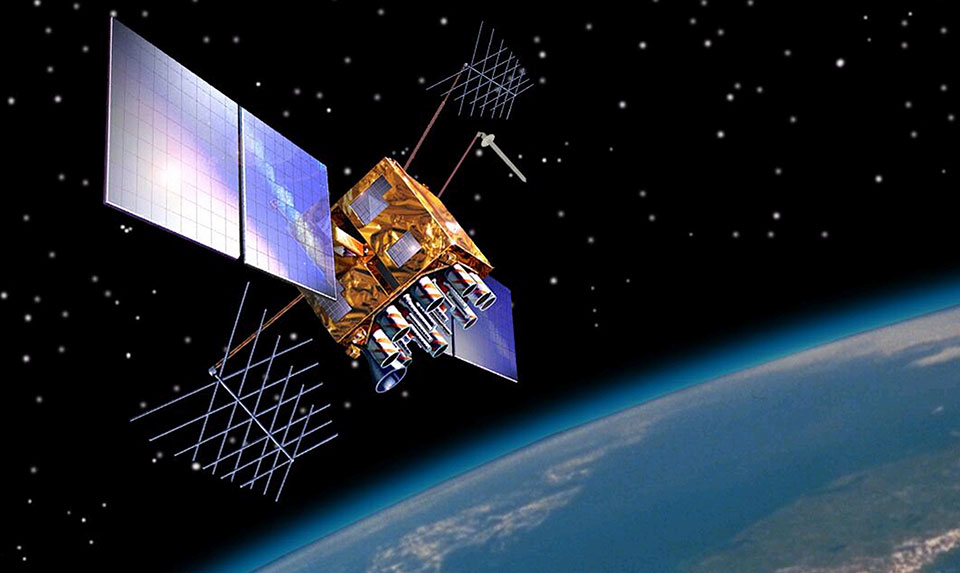
High above Earth, more than 30 GPS satellites orbit in carefully timed paths,
each carrying an atomic clock that keeps time with extraordinary precision.
These satellites constantly broadcast radio signals that include both the
exact time and their position in orbit. Because their locations
are predictable, the signals act like invisible beacons, crisscrossing the
planet in a grid of timing pulses. Anywhere on Earth, at least four satellites
are visible
in the sky, ensuring that a receiver can always get enough
data to determine where it is.
On the ground, a GPS receiver—whether in a smartphone, truck, or
aircraft—listens for those signals. By comparing the time a signal was sent
with the time it was received—meaning the speed of light is a factor!—the
device calculates the distance to each satellite.
With distances to at least four satellites, the receiver uses a process called
trilateration to solve for its own latitude, longitude, altitude, and even the current time.
In effect, the receiver doesn't just read the map—it locates itself within
the map, turning the user into a coordinate point in a living system.
This interaction makes us part of the map itself. Every time your phone calculates
a route, it's not only using satellite signals to place you on the grid—it's
also feeding anonymous location data back into mapping services. That's how traffic
maps update in real time: thousands of receivers reporting their speed and position
create a dynamic picture of the road network. In this way, GPS is more than a tool
for navigation; it's a feedback loop where satellites, receivers, and human movement
combine to generate a constantly evolving map of the world.
Given how far mapping has come, it should be no surprise that future cartographic
advances are already being worked on. For example, artificial intelligence is
already being trained to read satellite imagery, detect changes in land use,
and predict risks like wildfires or flooding. Future maps will be less static
pictures and more predictive dashboards, showing not only where a river is but
where it might overflow next week.
Once the idea of mapping took hold, it escaped the boundaries of geography and
became a way of thinking about almost anything that unfolds in space or time.
Historians map centuries into timelines; doctors map symptoms across spectrums
to understand psychiatric diagnoses; economists map flows of money and trade;
even our daily routines can be charted as patterns of energy and rest. A map,
in this broader sense, is not just a picture of terrain but a framework for
organizing complexity—turning scattered data into a landscape we can
navigate. What began as a sketch of rivers and mountains has become a universal
metaphor, helping us orient ourselves in domains as varied as memory, health,
and culture.
From the first scratched lines on stone to the glowing screens in our pockets,
mapping has always been about more than finding our way—it's about
making sense of the world. The Bronze Age slab, the Babylonian tablet,
the Mercator projection, the GIS database, the GPS satellites and the smartphone app are all
chapters in the same story: humans inventing tools to orient themselves in
landscapes both physical and abstract.
Once we learned to map rivers and mountains, we began mapping time, memory,
and even the mind itself. Today, every car on the highway doubles as a
traffic sensor, every phone as a navigator, and every dataset as a potential
layer in a vast, living atlas. The map has become less a picture than a
metaphor, a way of seeing connections across existence. If the old cartographers
gave us compasses, the new ones hand us crystal balls—tools that don't
just show where we are, but hint at where we might be going.
And as the gods know, we need all the hints we can get!