|
By: Paul S Cilwa |
Posted: 1/7/2026 |
|
Page Views: 27 |
| Hashtags: #Fonts #Typography #MetalType #Phototypesetting #PostScript #TrueType #OpenType #VariableFonts #BzierCurves #Rasterization #Hinting #Antialiasing #DesktopPublishing |
| How fonts evolved from physical metal type to digital typography, tracing the shift from hand-set sorts to phototypesetting, PostScript, TrueType, OpenType, and modern variable fonts, including how digital letterforms are rendered, hinted, and rasterized on screens. |
| Estimated reading time: 3 minute(s) (499 words) |
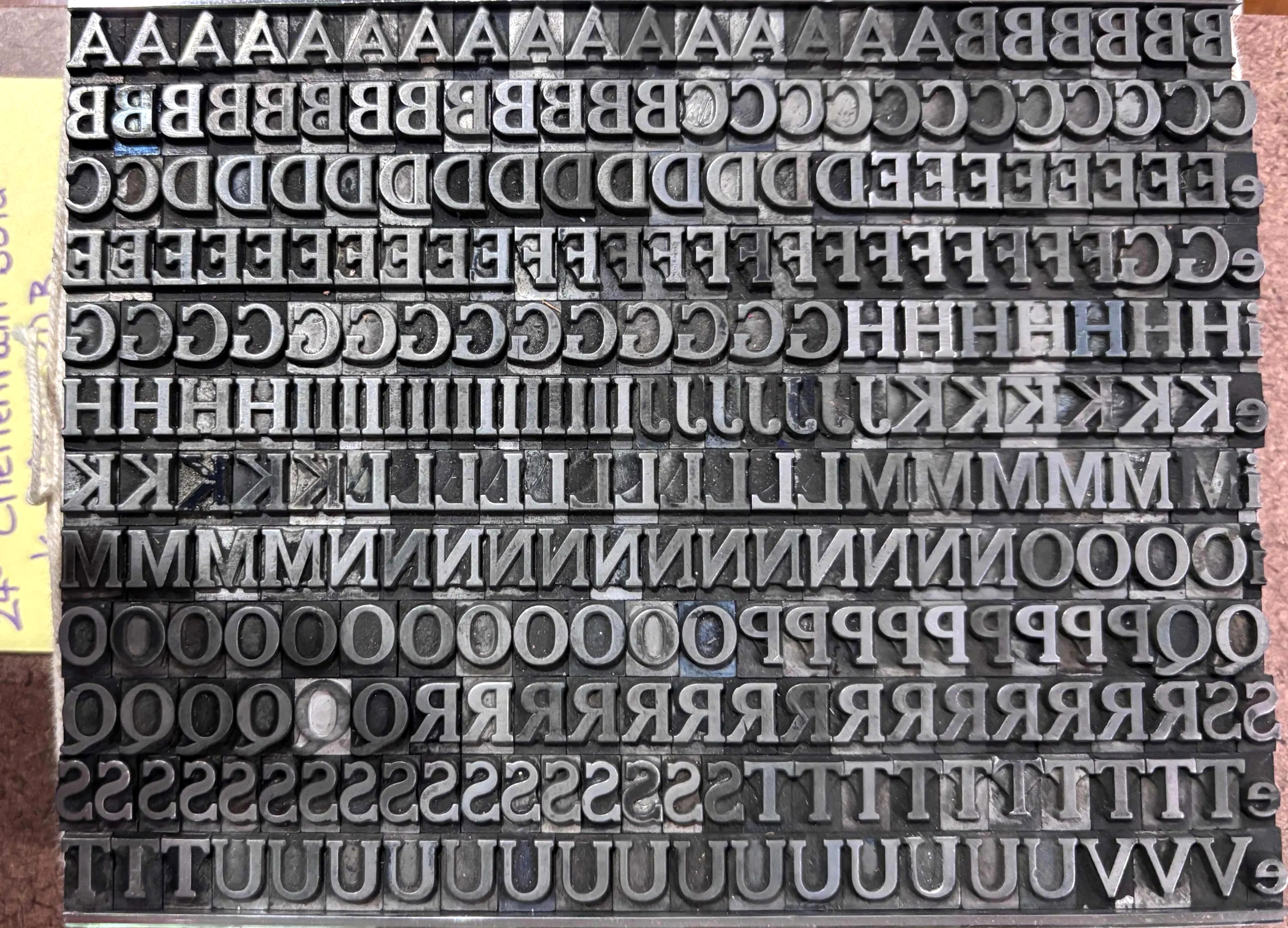
The first digital letterforms were born in laboratories and on early display hardware. Researchers
in the 1950s and 1960s experimented with vector strokes on CRTs and dot?matrix representations for
printers and terminals; those experiments reframed letters as mathematical or pixel data rather
than metal pieces, enabling programmatic scaling and manipulation. As phototypesetting and desktop
publishing matured, two competing outline paradigms emerged. Adobe's PostScript Type 1 used
Bézier curves and a page description language that let printers render high?quality scalable
shapes; Apple and Microsoft developed TrueType as an alternative with a different hinting model and
tighter OS integration, partly to avoid licensing costs and to improve on?screen clarity. Those two
families dominated the 1980s and early 1990s and set the stage for a unified architecture.

OpenType, introduced in the mid?1990s, combined the best of both worlds: it accepted either
TrueType or PostScript outlines while adding a rich layout and feature model (glyph substitution,
positioning, large glyph sets, and script?specific tables) and broad Unicode support, which was
essential for global scripts and complex writing systems. OpenType's architecture made it possible
to ship a single font file that could contain small caps, ligatures, alternate glyphs, and
thousands of CJK characters, and it standardized how applications and operating systems accessed
typographic features.
Translating fonts to screen involves several layers. The font file supplies outlines and metrics;
the operating system and rendering engine rasterize those outlines into pixels at a given size and
resolution, applying hinting or grid?fitting instructions to preserve stroke contrast and alignment
on low?resolution displays. Anti?aliasing and subpixel rendering smooth edges, while modern engines
also apply optical sizing and variable axes when available. Variable fonts, a recent extension of
OpenType, pack continuous axes (weight, width, optical size) into a single file so designers can
interpolate many instances without multiple files, improving performance and flexibility.
Throughout this migration the same typographic goals persisted—legibility, rhythm, and
cultural appropriateness—while the tools changed from punches and matrices to Bézier
curves, hinting programs, and layout tables. The result is a typographic ecosystem where a
font
can be a single historic metal inventory, a discrete digital file like a TrueType or
PostScript Type 1 face, or a modern OpenType/variable font that behaves like many fonts at once.