|
|
|
|
Page Views: 807 |
| Hashtags: #VisualBasic60 #ProgrammingforMicrosoftWindows |
| Chapter 6 of this free online course in Visual Basic 6.0. |
| Estimated reading time: 24 minute(s) (5705 words) |

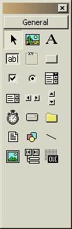
The Toolbox is sizable, dockable (by default), and will automatically adjust the buttons within
to the available space—except, if you make the Toolbox too short to display all
the buttons, there is no scrollbar and no visual indication that all the buttons
can't be seen. So I usually make it three buttons wide.
You can also create multiple "categories" (the starting category is
"General") and move various controls into whatever categories you like. This is
handy if you are working with a great many different controls in the same
project, but I have never found it necessary.
There are a couple of ways you can get a control onto a form, using the
Toolbox. One is, simply double-click the desired control, and one of them will
appear, in an arbitrary place and at an arbitrary size, on the form. You can
then resize and re-position it.
But, if you have to do that anyway, why not place it where you want it to
start with? So my preferred method is to click once on the control, then
"rubber-band" on the form where and how big I want the control to be.
After you've placed a control on a form, it is selected until you click
somewhere else on the form. So, if you want to work with the control
further—and this is common—you just remember to click on it again to
re-select it, then do what you want to do.
Frequently Used Properties
Now that you've had a taste of putting a control on a form, let's look at
some properties you will find pretty much all controls share. Since they work
similarly for each kind of control, learning them will bring you a long way.
(Name)
The Name property is displayed in parentheses so that it will sort to the top
of the property list. Its real name is Name, however; and it can be read
at run-time that way. (It cannot be changed at run-time.)
This property is required—in fact, it is so required that when the
control is first placed on the form, a name is made up for it, like "Picture1"
or "Text2". These are not generally useful names, however; and you are
encouraged to change them to something more specific.
Microsoft recommends you use a prefix for the name that indicates the kind of
control—like, "lblFirstName" for a label that will display someone's first name,
or "txtFirstName" for a text box that will allow an end user to type one in. In
general, I do find prefixes for controls to come in handy; but to make them
easier to read, I recommend adding an underscore after the prefix:
- lbl_FirstName
- txt_FirstName
It doesn't really matter what prefix you use, since the purpose is to keep
the controls of the same type sorted together in a dropdown list.
Now, some controls—most labels, for example—will never be accessed
programmatically. In that case, I see no reason to waste time on them; and leave
them called Label1, Label2, Label3, etc.
The name of a control must be unique per form—except in the
case of a control array. This is where you have several controls of the
same type, that share the same code. They then have the same name, as well; but
their Index property will be different.
Index
The Index property is unique, because it is optional—it may have a
value, or it may not. If it has a value, the value must be numeric and greater
than or equal to zero.
If a control's Index property is supplied with a value, that control
is a member of a control array—even if it is the only member. Also, while
the values must be zero or more, they need not be contiguous. You can use any
values that make sense for your application; when the shared code is invoked,
the Index value will be passed to it so it will know which element of the
array it is working on.
Top, Left, Height, Width
These four properties specify the location and size of a control. Top
and Left are relative to the upper left-hand corner of the form or parent
control on which the control rests. All four values are in twips, or
whatever units are specified by the ScaleMode property.
Font
Since we're talking about printers, twips, points, and so on, we may as well
look at the Font property. This is the first property we've examined that
is, itself, an object. (Worry about what that means, later; for now, just
remember that it is.) All objects can (and are likely to) have properties, just
as forms and controls have properties. And so the Font property does.
Among its more significant properties are
At design time, you select a font via the usual font selection dialog box. At
run time, you can alter specific properties, thus:
MyForm.Font.Name = "Times New Roman"
MyForm.Font.Size = 12
MyForm.Font.Bold = True
Or, if another component holds the font you want, you can copy the whole
thing at once. Note the use of the Set statement:
Set MyForm.Font = MyForm.MyLabel.Font
Why did we use Set in the last statement, but not in the first set?
Because Name, Size and Bold are not objects. Font
is, and when you are assigning another object as the new value of an object
property or variable, you have to use Set. Relax; we'll cover this in
more detail later, including why. For now, I just wanted you to see
it.
Caption / Text
These properties are generally the reason why a specific control
exists. For example, a Label control: The only reason you bother to put one on a
form is for its caption. The only reason you put a Text control on a form is for
the text the user will enter. Caption and Text properties are
basically the same thing; and I've never known one control to have both—it's one
or the other, or neither.
These are text properties. We've already seen the Picture property, in
the last chapter; you'll find that on controls that display images. There's also
a Value property you find on controls that provide on/off or numerical
values.
Enabled
There are times when a given control must not respond to clicks from the end
user. For example: If the data is not correct or complete on a dialog box, the
user should not be able to click the OK button. How to prevent that? Simply set
the OK button's Enabled property to False.
You can disable a control at design time by setting the Enabled
property to False in the Property Window. At run-time, simply make the
assignment:
MyForm.cmd_OK.Enabled = False
Visible
Similar to the Enabled property, the Visible property can be
set at design or runtime. If Visible is False, the control cannot be seen
or used at run-time. It is real, it is there; its properties can be changed at
run-time but the end user cannot see or interact with it.
Remember that the effect only occurs at run-time; the control or form looks
perfectly normal at design-time.
Toolbox Contents

Pointer
This is the only thing in the Toolbox that does not place a control on
a form—it is used to select a control that's already on a form (or
elsewhere). It is also used to select the form itself, by clicking on the form
at a location where there are no controls.
You can also select several controls on a form in either of two ways.
You can "rubber-band" the controls by holding down the left mouse button
while dragging diagonally, creating a dotted rectangle that includes the
controls you want to select. When you let go of the button, the controls will
be selected.
You can click on the first control you want to select, then hold down the
shift or control keys and click the rest.
Once a control is selected, you can place the mouse in the middle of the
control and drag to reposition it; or you can drag one of the little rectangular
handles that outline the control to resize it.
By the way, when a control or group of controls are selected, you can use the
usual editing commands on them: You can delete them, or copy or cut them into
the Clipboard; if there are controls in the Clipboard, you can paste them onto
the currently active form.

Picture Box, Image
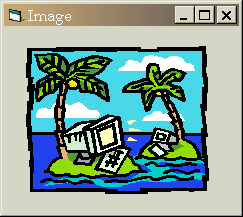
Default property: Picture
You might wonder why there are two controls for displaying pictures. Well,
the Picture Control was the first one to come along. Originally, it was intended
to display graphics. However, it was used for other purposes, as well;
specifically, to contain or group other controls. Now, you might wonder
why someone would want to put controls in a control. But picture this:
suppose you have a map of the United States and you would like to label cities
on it and allow the end user to select a specific city for some purpose. All you
have to do is put a Picture control on the form, put a United States map graphic
in the control, and then add Option buttons on top of the map where the cities
are located. The Picture control is perfect for this.
However, with time, the Picture control developed so many extra capabilities
(such as OLE drag-and-drop) that it used too many system resources for so simple
a job as simply displaying a graphic. And so the Image control was introduced.
The Image control does nothing but display a picture. It is considered a low
resource or "lightweight" control. In technical terms, it does not require an
underlying Windows window, which saves a fair amount of memory.
So, use an Image control to display a graphic, and a Picture control to group
other controls with or without a graphic.
There is another difference between an Image control and a Picture control.
The Image control has the ability to stretch a bitmap larger or smaller than its
natural size. To do this, set its Stretch property to True. The Picture
control does not have that ability, but it is able to adjust itself
to the size of the bitmap in it. That feature is controlled by the Picture
control's Autosize property.
As stated in the chapter on colors and graphics, you can place a graphic into
a Picture control or an Image control, either by using the Load Picture dialog
(available through the Property Window), or by simply pasting a graphic from the
clipboard when the control is selected.

Label
Default property: Caption
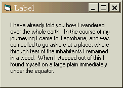
The Label control
is used to display text to the end user. This text is usually specified at
design time, but it can be altered by the program whenever necessary.
The Label control supports left, center, or right justification; it does not
support left-right justification. However, it does support word wrap. To take
advantage of this feature, simply make the Label control as tall as need be to
display all the desired text.
On the other hand, many times a Label control is used to display only a small
amount of text. If the Autofit property is set to True, the label control
will grow shorter or longer, as needed, to hold the required text, and no more.

Text
Default Property: Text
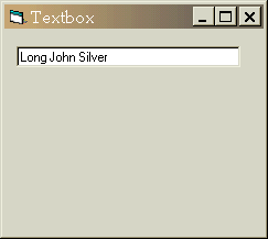
Most dialog boxes require the end user to enter textual information …
sometimes, a great deal of it. The Text control (commonly called "Text box") is
the primary control used for this purpose. When a dialog box first appears, it
can be empty, or it can already contain default text. The default text can be
set at design time or at run time.
The Text box, like the Label control, can display its contents left, center,
or right-justified,. The Multiline property will allow more than one line
of text to be entered. To allow for this, make the Text box tall enough for
several lines of text, and set its Multiline property to True.
The Password property, if set to True, causes the text to appear as a
line of asterisks.
You can write code to enforce data entry requirements or data validation;
but, in many cases, it is easier to use the Masked Edit control bundled with
Visual Basic.

Frame
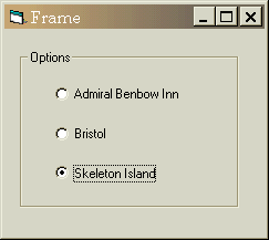
Default property: Caption
The Frame control is used specifically to group other controls. Now, above,
we learned that the Picture control also groups controls. So, why are there two
controls to do this?
Actually, there are any number of controls that can group other controls—you
can write them yourself. But the answer is that the Picture control is primarily
intended to group controls on top of a graphic. The Frame control groups
controls in a familiar way, without displaying an underlying graphic.
Please note that Option buttons, which we will encounter next, must be
grouped, in order to work properly. Consequently, we almost always put Option
buttons in a frame control. However, we often use the Frame control simply to
provide a visual distinction between one group of controls and another.
In other Windows programming environments, there is a control called a "Group
box" that looks visually like the Frame control. However, the Group box is only
a visual effect. Controls that lie within it are not a part of it. Controls
placed on a Frame control become part of that control. If the Frame control is
deleted, the controls in that are deleted, too. If the Frame control is moved,
the controls in that retain their positions relative to the upper left hand
corner of the Frame control.
Consequently, if you have one or more controls in the Clipboard, and you
would like to paste them into a Frame control, you must first select the Frame
control, then use the Edit..Paste command.
If you accidentally put a control inside a Frame control, the only way to
move it onto the form is to select it, use the Edit..Cut command,
deselect the Frame by clicking on the form, and using the Edit..Paste
command.

Option Button
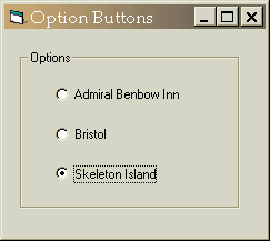
Default property: Value
Before Visual Basic was introduced, this control was called the "Radio
button". These controls are always found in groups. They offer mutually
exclusive choices, allowing the end user to select one choice.
If you only have one set of options on a form, the Option buttons can be
placed directly on the form. However, if you have more than one set of
choices—for example, the user can select one of several colors and also one of
several sizes—each set of option buttons must be placed in a separate group
control; and the most common type to use is the Frame control.
Please note that sometimes, one or more of the choices may not currently be
appropriate. In that case, set the enabled property of the unavailable Option
button to False. If you disable an Option button that was previously selected,
don't forget to deselect that button by selecting the most likely of the
remaining, enabled choices. If you do not, even though disabled, the button will
continue to appear as if it were selected; and the end user will not be able to
change it.

Checkbox
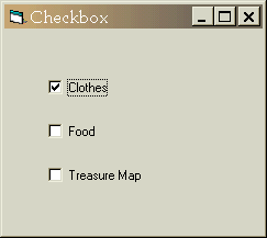
Default property: Value
The Checkbox control allows the end user to select individual choices which
are not mutually exclusive. There may be one choice or several. A variation is
the three-state form, which allows for true, false, and neither true nor false.
For example, if a word were selected, and one of the letters in the word was
italicized but the rest were not, a check box labeled "italics" would be in the
third state, because all of the letters of the word are not italicized; on the
other hand, neither are they all not.
As with Option buttons, you should disable any choices that are not currently
appropriate. Usually you will uncheck disabled checkboxes, but that is up to you
and the situation.

Command Button
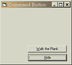
Command buttons are usually used on modal dialog boxes. They are seldom used on a form that has
a menu. They indicate an immediate action, rather than a modification of the
current document.
On every form, there may be one default Command button. This is the
button that is pressed automatically if the user hits the enter key. It is
usually the OK button. However, if the gist of the dialog box is, "Do you want
to delete your entire data base?" perhaps the OK button should not be the
default.
Similarly, one Command button on the form can be the cancel button.
This is the button that is pressed automatically if the user hits the Escape key
on the keyboard. It is usually the button with the caption "Cancel" or "Close".
It is important that you use the cancel button correctly. The word "Cancel"
means cancel! It should not appear on a dialog box whose action cannot be
undone. It is fairly common for a dialog to appear with a Cancel button whose
caption changes to "Close" after an unretractable action has occurred, so as not
to imply to the end user that the action can be canceled.
As the end user is filling out the fields on a dialog box, he or she may
inadvertently enter incorrect data or omit a required field. At such times, the
OK button should be disabled. It is not considered user friendly to allow the
user to make a mistake, and then chide them for it. If the user might not know
why
the OK button is disabled, you should provide a label near the bottom of the
dialog box that will explain what the problem is. I call this label the "Hint
bar".

Listbox
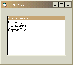
Default property: Text (read-only)
The Listbox control is used to display a list of items from which the user
can select one or more. If the user can select only one—that is, the choices are
mutually exclusive—it is called a single-selection Listbox. If the user
can make several selections, it is called a multiple-selection
Listbox. To create a multiple-selection Listbox, set its MultiSelect
property to Extended.
You can populate the Listbox at design time or at run time. At design time,
you use the property window to locate the List property. This property is
accessed through a drop down list. To make several entries into the list, hold
the shift key down while pressing the Enter key to go to the next item. At run
time, you use the AddItem method:
MyList.AddItem "Fred"
The List property is also used to access items in the list at run
time. It is an array property, which means you must provide the index
of the specific item you want (the numbering starts at zero). The ListIndex
property will tell you which item is currently selected. However, there is a
shortcut to retrieve the currently selected item: the Text property
(which in this control is a read-only property).
lbl_Selection.Caption = MyList.List(MyList.ListIndex)
or
lbl_Selection.Caption = MyList.Text
In a multiple selection Listbox, the ListIndex property indicates the
last item to be clicked; that item may or may not be currently selected. In a
multiple selection Listbox, one click on an item selects it; the next click
deselects it.
If you need to know which items are currently selected, you can use the
Selected
array property. This property also works in a single selection Listbox; but in a
single selection Listbox the ListIndex property is easier to use.
Both the ListIndex property for a single selection Listbox, and the
Selected
property for either type, can be used programmatically to select or deselect
items. To deselect all items in a single selection Listbox, set the ListIndex
property to -1.

ComboBox
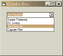
Default property: Text
The ComboBox appears to be a combination of a Text box and a ListBox, and
that's exactly what it is. As a ListBox, it is limited to single selections.
The ComboBox has a Style property with three possible values. The
Simple Style displays the ListBox and the Text control just above it. The
Dropdown Style only displays the Text box and a button with a down arrow.
When the button is pressed, the ListBox appears. The third Style is the
Dropdown List. It is like Dropdown, except that the Text box part cannot be
typed into.
Why use a ComboBox when the ListBox and the Text box already exist? Well, the
ComboBox does provide a couple of features that the separate controls do not.
For one thing, when the end user clicks on an item in the list, that item is
automatically copied into the Text box part. Also, the Dropdown and Dropdown
List styles take up much less space on the dialog box, yet would be annoying to
have to program over and over.
Like the ListBox, the ComboBox has a List array property and a
ListIndex
property. However, since multiple selection is not supported in the ComboBox,
there is no Selected property. And the Text property can be
written to as well as read.

Timer
The timer control is the first control that we've come to that the end user
cannot see. It is what is called an invisible-at-runtime control. Such controls
were invented before ActiveX. At that time, the only way to encapsulate behavior
into an object, was to design it as an invisible-at-runtime control.
You place the timer control in any convenient place on form. In the Property
Window, you set the interval property to the number of milliseconds you wish to
pass between Timer ticks. When you double-click on the timer control, a code
window will open to the Timer event. This is where you put the code that is to
execute each time the timer ticks. To stop the timer from ticking, set its
enabled property to false.
Control Arrays
You'll recall from our earlier discussion of variables that it is possible to
have an array of variables; that is, one name describing a whole set of
variables of the same type. Well, we can also have an array of controls.
Now, what does it mean to have to an array in an object-oriented environment?
To figure this out let's first consider how arrays are used in the traditional,
linear environment. Usually, when you have an array, once the individual values
have been assigned or calculated, you run through the elements of the array in
some kind of loop, making use of each of them in the same block of repetitive
code.
From an object-oriented perspective, this is inside out. Since an individual
object holds its own instructions within it, it makes sense that an array of
objects would also contain their own instructions. Put another way, the objects
in an array share the same code. And since all controls in Visual Basic are
objects, that rule applies to them as well.
The usual way to create an array of controls is to first place a control of
the desired type on a form. In the Property Window, set the Index
property to zero or some other numeric value. Then, place another control of the
same type on the form, giving it the same name. The Index property of the
new control will automatically fill in with the next number.
Alternatively, after the first controls placed on the form and its properties
are set, you can use the Edit..Copy command, followed by an
Edit..Paste. You will be prompted as to whether you would like to create a
control array. If you answer yes, the Index property of the first control
will be set to 0, and the Index property of the new control will be set
to 1. Additional pastes will not prompt you; Visual Basic understands that you
know you are creating a control array.
Remember that, when its Index property has a value, a control is a
member of a control array even as it is the only member. The combination of
control Name and Index must be unique per form.
Dynamic Controls
Most of the time, control arrays created at design time are adequate.
However, sometimes, you want to create additional elements of a control array at
run time. For example, if you are designing a calendar and you would like to use
a command button for each day of the month, you could create an array of
twenty-eight command buttons at design time, and add however many additional
buttons are needed, at run time.
In order to make use of dynamically created controls, you must have at least
one element of the control array on the form at design time. It does not need to
be visible, but it needs to be there. At run time, when you want to create the
additional control, you use the Load statement to create additional elements.
The newly-created control will be invisible, which gives you a chance to modify
its other properties before you set its Visible property to True:
Load MyLabel(10)
MyLabel(10).Top = 200
MyLabel(10).Left = 200
MyLabel(10).Visible = True
To remove a dynamically created control, you use the Unload statement. Please
note that you cannot remove a control that was placed on the form at design
time.
Unload MyLabel(10)
If you try to create an element whose Index already exists for that array, it
will trigger a Visual Basic exception. Likewise, if you try to remove a control
that does not exist, or that was placed there at design time, that will also
trigger a Visual Basic exception. We have not yet discussed Visual Basic errors
and exceptions, but they can be caught in code and dealt with.
When Your Form Is Complete
Once you have finished placing controls on your form, and they are positioned
and sized the way you want, it is very annoying to click on them later and
accidentally nudge them away from where they are supposed to be. You can prevent
this happening by using the Format..Lock Controls command. This command
is applied on a form by a form basis.
Even when controls are locked, you can reposition them by changing the Top,
Left, Height, or Width properties in the Property Window.
You can also reposition them when they are selected, by using the CTRL+arrow key
combination.
TabIndex
Amazingly, not everyone likes to use a mouse. You might even be one of them.
If you are not, however, be sure not to forget to test your forms and make sure
they work with the keyboard in the way a keyboarder will expect.
Particularly, people expect that when they hit the tab key, the focus will
move to the next control to the right; if no controls remain on that line, then
the leftmost control on the line below that should get the focus.
This isn't a problem if you design your forms on paper first, and then create
them on a computer. However, the computer makes an excellent design tool for
forms; and when you're done, you can continue working with what you've created.
That usually means, however, that your controls were not placed on the form in
the right-to-left, top-to-bottom order a keyboard user would expect. That's why,
after laying the controls down, you need to reset the TabIndex properties
of those controls.
Unfortunately, there is no easy way to reset the TabIndex properties on a
form in Visual Basic. There are some third party tools that do make it easy, for
example the program
VB Assist. However, we cannot discuss third party tools here. So, we have to
look at the only method Visual Basic provides us for setting the TabIndex
property.
To reset the TabIndex properties, click on the control that is closest
to the upper left hand corner of the form. Go to the Property Window. You should
be able to find the TabIndex property. (Only lightweight and
invisible-at-runtime controls do not have a TabIndex property. )
For the uppermost left-hand control, set the TabIndex property to 0.
Now, click on the control that would come next in order. It doesn't matter if
it is not an input control. It still has to be ordered. Set its TabIndex
property to 1. Then continue with each subsequent control, giving each
TabIndex property the next consecutive number.
Yes, it's a tedious operation; but it is part of creating any efficient,
intuitive user interface for all your users.
The reason you must set the TabIndex property for Label and Picture
controls as well as Text and Listbox controls, is that the hot key specified in
the Captions are also part of the keyboard interface. When a user taps a
hot key, the focus is supposed to go to the control immediately following it. If
the labels do not have a TabIndex one less than the control that follows
them, the user will receive very puzzling results.
When you're done, you have the following controls on your form:
| Type | Name | Caption |
|---|
| Label | lbl_Title | Application |
| Label | lbl_Version | Version |
| Label | lbl_author | Written by |
| Label | lbl_Copyright | Legal Copyright |
| Command | cmd_OK | OK |
| Image | img_Icon | |
The cmd_OK command button should also have the Default
and Cancel properties set to True, and the img_Icon control may
have an icon placed into its Picture property (to make it easier to
see) but it doesn't need to, since we'll be assigning one programmatically
in the next chapter.